July 14, 2026
The Designer's Secret Weapon
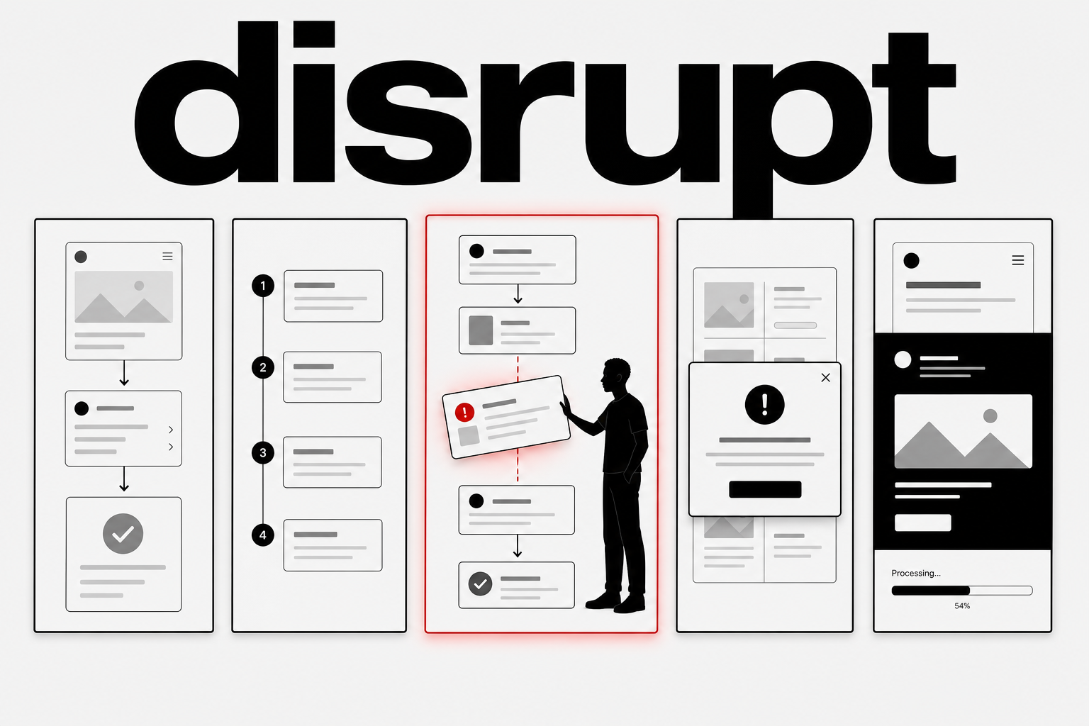
Most designers spend their careers learning to create smooth flow. The next level is knowing exactly when to break it.

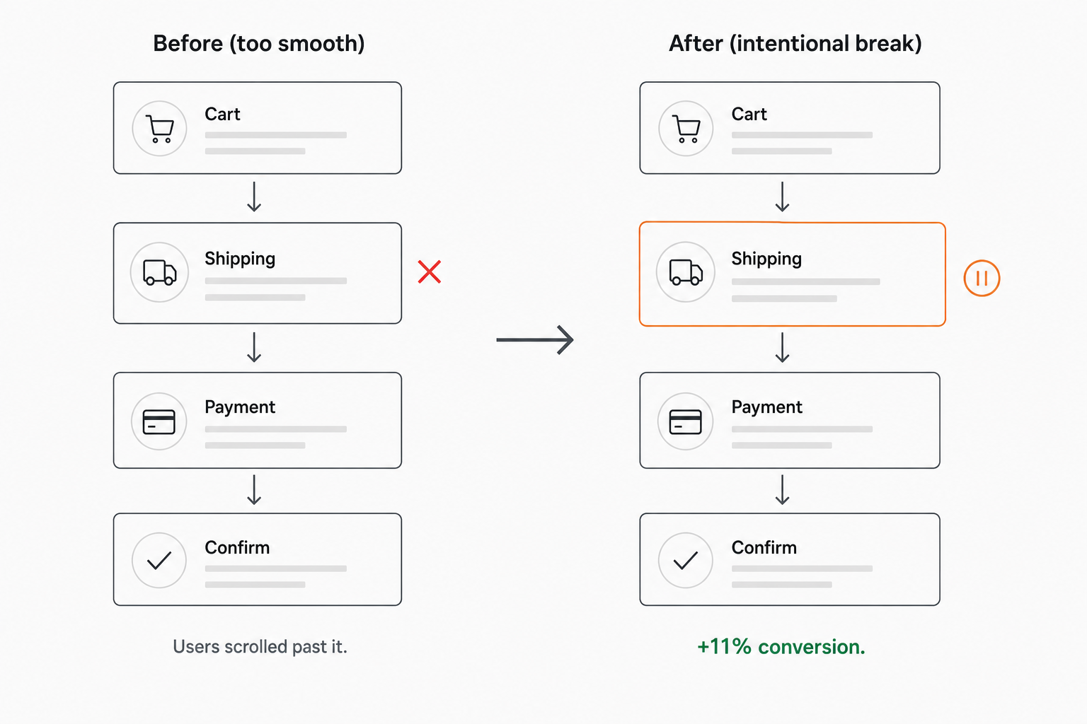
Early in my career, I designed a checkout flow that was technically flawless. Four steps. Clear labels. Obvious buttons. Every heuristic satisfied. Every accessibility check passed. It was, by every measure I knew at the time, good design.
Users kept missing the shipping method selector. Not because it was hidden. Because they were scrolling too fast. The flow was so smooth, so frictionless, so perfectly linear that their eyes were already at the purchase button before their brain had processed step three.
I fixed it by breaking the flow on purpose. A subtle visual interruption: a slight border shift, a gentle pause in the otherwise relentless forward momentum. Nothing that felt like an error. Just enough to say: stop here. This part matters.
Conversions went up 11%. Not because I made anything easier. Because I made one specific moment harder to skip.
That’s flow disruption. And in UI/UX design, it’s one of the most underused tools you have.
What flow disruption actually is
In graphic design, flow disruption is a visual technique. You place a rotated element across the reader’s eye path. The eye hits it, pauses, navigates around it. The brain registers the interruption and re-engages with the composition. It’s why posters with one tilted element feel more dynamic than perfectly aligned layouts.
In UI/UX, flow disruption serves a different purpose. It’s not about visual dynamism. It’s about decision architecture. Every time you break the user’s automatic scanning behavior, you create a moment where they switch from passive consumption to active choice.
That moment is expensive. You can’t use it everywhere. But when you use it in the right place, it’s the difference between a user who clicks through your interface and a user who actually understands what they’re doing.
The three places it works
After years of watching users interact with interfaces, I’ve found flow disruption works in exactly three situations. Outside of these, it’s just friction wearing a designer’s justification.
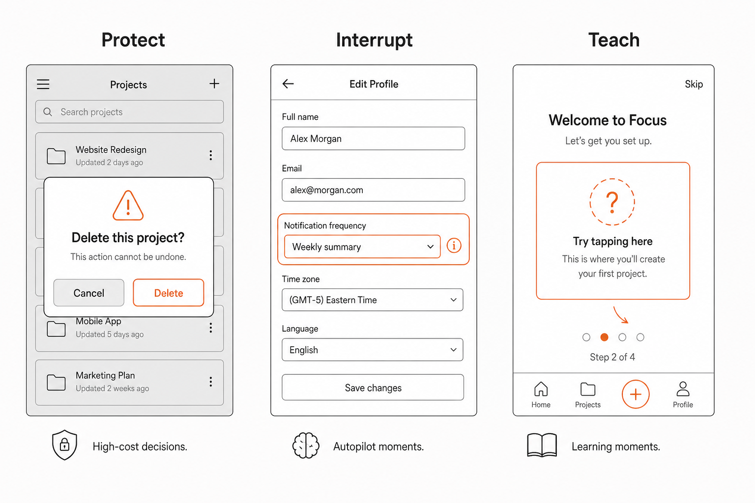
One: when the cost of getting it wrong is high. Delete confirmations. Payment confirmations. Anything irreversible. The modal that blocks the entire screen isn’t bad UX when the alternative is a user accidentally deleting three months of work. Flow disruption here is protective. You’re not slowing them down. You’re saving them from themselves.
The key: disruption should scale with consequence. Deleting a single list item can use a subtle undo toast. Deleting an account should feel like a speed bump at 60mph. The intensity of the interruption should match the weight of the decision.
Two: when the user is on autopilot and about to miss something. My checkout example. The onboarding step everyone skips. The permissions dialog nobody reads. The setting that changes behavior in a way the user won’t notice until next week.
When users are in scanning mode, they’re not reading. They’re pattern-matching. They see familiar layouts and fill in the gaps with assumptions. Flow disruption breaks the pattern. It says: this part is different. Pay attention. Not everything. Just this part.
The skill is in knowing which parts. Most of your interface should be smooth and predictable. The parts that aren’t should be the parts where a wrong assumption has consequences.
Three: when you want to teach, not just complete. Onboarding flows that let you tap “Next” six times and arrive at an empty dashboard are the worst kind of smooth. The user completed the flow and learned nothing. A well-placed disruption, an interactive moment, a question they have to answer before proceeding, turns a passive walkthrough into active learning.
Duolingo does this masterfully. The lesson flow is smooth until it isn’t. A new word appears and suddenly you’re not tapping through. You’re thinking. The disruption isn’t friction. It’s pedagogy. The break in flow IS the lesson.
Where it fails
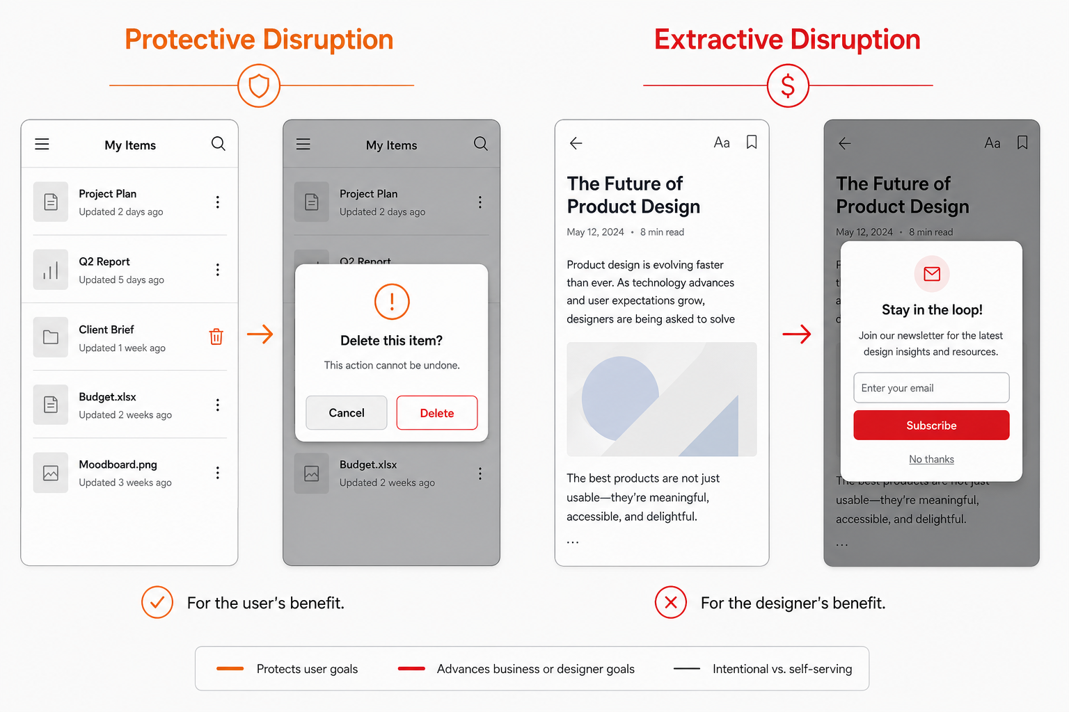
Flow disruption fails when it’s used for the designer’s benefit instead of the user’s.
The newsletter modal that appears three seconds into reading. The cookie banner that blocks the entire page. The “rate our app” dialog that interrupts a task in progress. These aren’t flow disruptions. They’re ambushes. The designer knows the user doesn’t want to see this. They’re betting the interruption will extract a conversion before the user closes it.
The difference is intent. Protective disruption says: I want you to pause because this decision matters. Extractive disruption says: I want you to pause because I want something from you. Users can feel the difference. They might not articulate it, but they feel it. One builds trust. The other burns it.
The test is simple. Would you still add this disruption if it decreased your conversion metric but increased the user’s understanding? If the answer is no, you’re not designing a flow break. You’re designing a dark pattern.
How to do it without feeling like an error
The hardest part of flow disruption is making it feel intentional, not broken.
A sudden color change without context looks like a visual bug. A random modal without clear purpose feels like spam. A spacing shift without hierarchy looks like a layout mistake. The disruption has to announce itself as deliberate or the user assumes something went wrong.
Three techniques that work:
Contain the disruption. Don’t break the entire page. Break one element. A single card with a different border treatment. One section with inverted colors. The rest of the interface stays predictable. The disruption signals: this one thing is different. Not everything is broken.
Give it a reason to exist. Empty states that explain what goes there. Loading screens that teach you something while you wait. Error messages that tell you what happened and what to do next. If the disruption doesn’t communicate, it’s just noise.
Restore flow immediately after. The best disruptions are short. A moment of pause, then forward motion resumes. The confirmation dialog appears, you confirm, it’s gone. The onboarding question is asked, you answer, the next screen loads. Don’t make the user work to escape the disruption. The disruption should do its job and get out of the way.
Try this on your next screen
Open any interface you’ve designed recently. Find the place where users move fastest. A list they scroll through without reading. A form they fill without thinking. A flow they complete without understanding.
Ask yourself: is there a decision here they should be making consciously? Is there something they’re missing because the flow is too smooth?
If the answer is yes, break the flow. Just a little. Just enough to make them pause. Not enough to make them leave.
That’s the secret weapon. Not more features. Not better visuals. Just knowing when to make the smooth thing a little less smooth, so the important thing gets seen.